Best Living Room Colour Combinations
You know that moment, right? You're sitting on your couch, staring at the walls, and suddenly it hits you: this room needs a vibe shift. Forget the whole "just pick a colour you like" advice. Your living room—the heart of the home, where you binge-watch, host game nights, and maybe even take a quick afternoon nap deserves a thoughtful colour story.
Picking the perfect colour combination is like finding the right coffee blend: it has to be balanced, hit the right notes, and just make you feel good. It’s not just about the paint on the walls; it’s the whole shebang: walls, furniture, accents. I’ve been playing around with palettes for years, and let me tell you, there are a few pairings that just work every single time.
So, grab your mug, and let's dive into some of the absolute best living room colour combinations, what to choose, where, and why they nail the aesthetic every time.
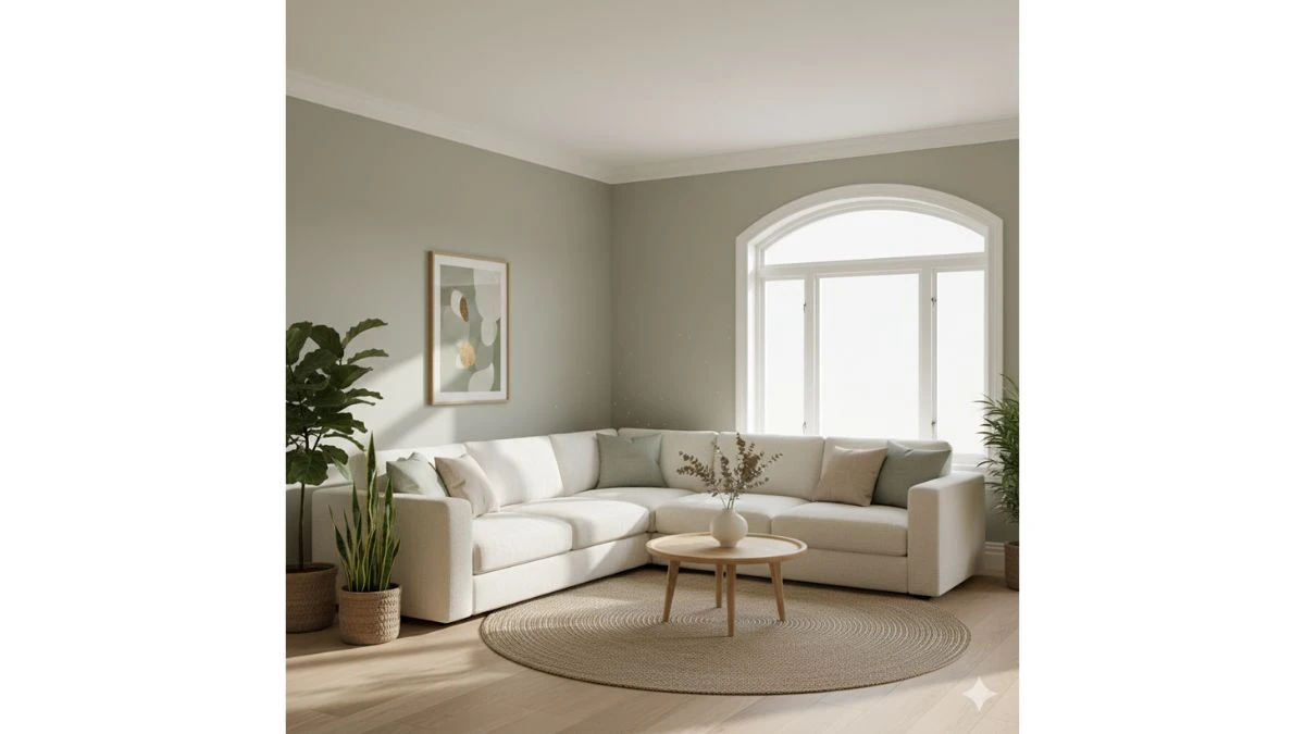
1. Sage Green & Creamy White
-
The Vibe: Calm, earthy, and totally chill. Like a restful Sunday morning.
-
Where to Use It: Sage on the walls (it’s a surprisingly good neutral!), and use the Creamy White for trim, ceiling, and a big, plush sofa.
-
Why It Works: Sage green brings the soothing feeling of nature indoors without being too much. The cream keeps it light and airy, preventing the green from feeling too heavy or, well, too green. It's a fantastic, low-commitment way to get some colour in your life.
Sage on the walls creates a calm, low-commitment neutral foundation, bringing nature indoors. Creamy White on trim and main furniture ensures the space remains light and airy. This pairing is excellent for a serene, organic, and effortlessly chill vibe. It balances muted colour with refreshing brightness for a restful sanctuary.
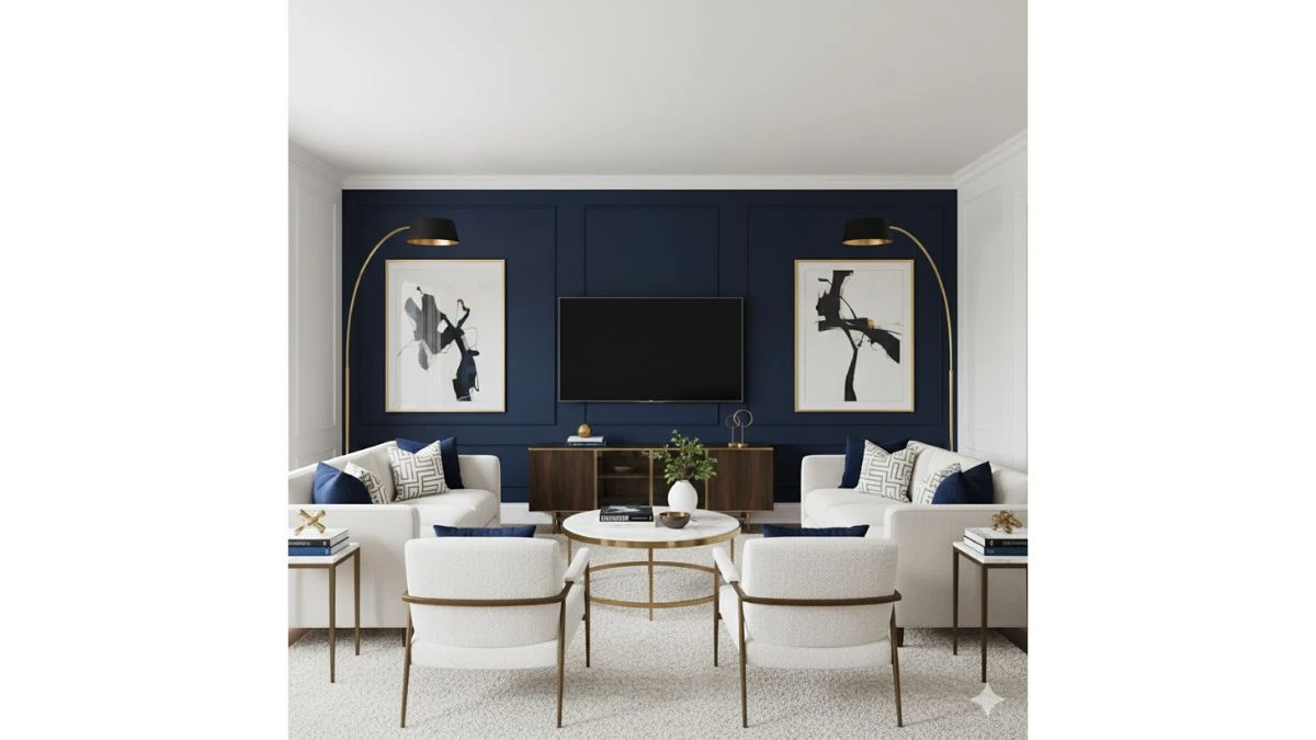
2. Deep Navy & Bright White
-
The Vibe: Classic, sophisticated, and a little bit dramatic. Think coastal chic meets library cool.
-
Where to Use It: Navy as a stunning accent wall behind the TV or sofa, with Bright White everywhere else. Use brass or gold accents (lamps, frames) to make it look super expensive.
-
Why It Works: It’s high contrast, which is always eye-catching. The navy adds depth and luxury, while the white makes the room feel crisp and spacious. It's truly timeless.
Use Navy as a dramatic accent wall to instantly add depth, sophistication, and luxurious contrast. Bright White on surrounding walls and ceilings keeps the overall room crisp and spacious. Accent with brass to amplify the elegance, achieving a timeless, high-contrast look that feels classic and refined.
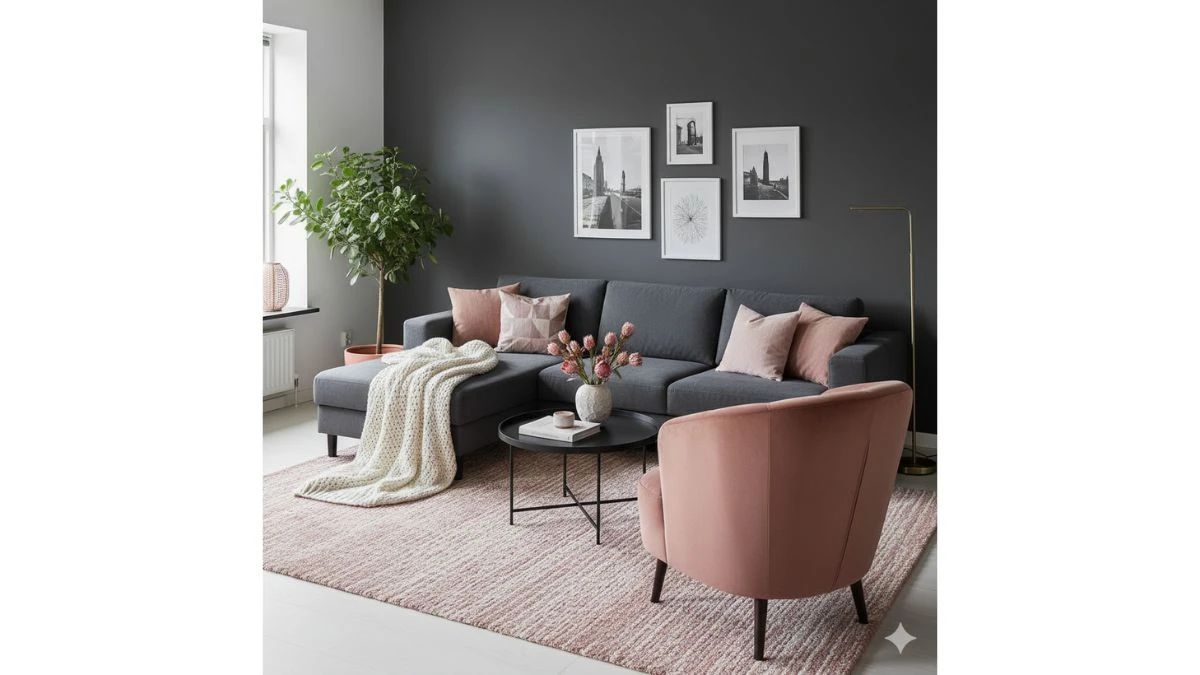
3. Charcoal Grey & Dusty Rose
-
The Vibe: Modern, romantic, and perfectly balanced. Not too masculine, not too sweet.
-
Where to Use It: Charcoal on the main walls for a moody, grounded look. Introduce Dusty Rose through textiles—think throw pillows, a velvet accent chair, or an area rug.
-
Why It Works: Charcoal is the ultimate neutral anchor. Dusty Rose adds a soft, warm blush that cuts through the grey's coolness. It’s sophisticated but still inviting.
Charcoal Grey grounds the room on the main walls, providing a modern, moody, and powerful anchor. Dusty Rose in soft furnishings (pillows, rugs, chairs) cuts through the coolness with a subtle, romantic warmth. This combination strikes a perfect balance between sharp modernity and soft, inviting comfort.
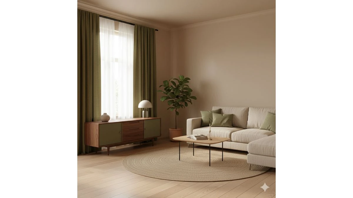
4. Beige & Olive Green
-
The Vibe: Warm, organic, and truly serene. Hello, natural light!
-
Where to Use It: Beige on all the walls—it’s warmer than pure white and just as versatile. Use Olive Green for curtains and maybe a statement piece of furniture, like a mid-century modern cabinet.
-
Why It Works: These are nature’s best friends. The combination creates a welcoming, restful space, and the beige ensures the room doesn't feel dark, even with a deeper green.
Beige is a warmer, welcoming alternative to white for all walls, setting a neutral and earthy backdrop. Introduce Olive Green through statement furniture or textiles for an organic, serene feel. The combination ensures the room is restful, warm, and inviting, leaning into an elevated, nature-inspired palette.
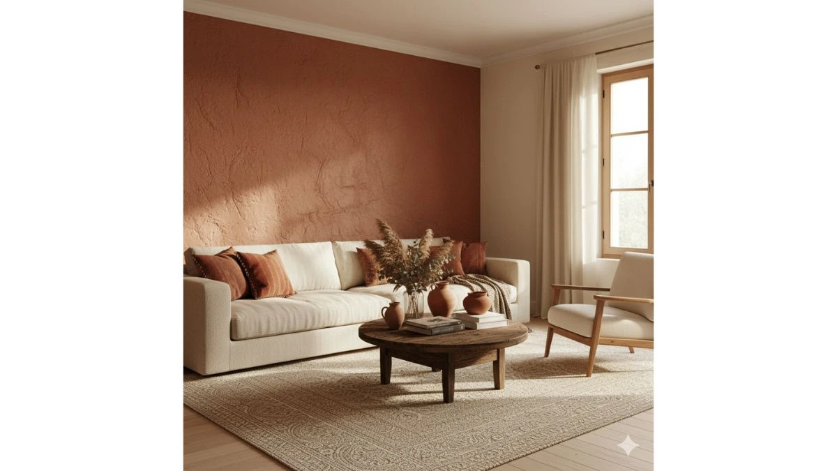
5. Terracotta & Cream
-
The Vibe: Rustic, bohemian, and a hug of Mediterranean warmth.
-
Where to Use It: Terracotta is gorgeous on an accent wall, perhaps one with some interesting texture. Use Cream for your couch and larger furniture pieces.
-
Why It Works: Terracotta, a rich reddish-brown, is instantly cozy. Cream lightens the palette and keeps it from feeling heavy, making it perfect for creating that rustic-but-chic vibe.
Apply Terracotta to an accent wall for a rustic, cozy, and sun-baked Mediterranean warmth. Cream is used on large furniture to lighten the palette and prevent the earthy tone from feeling heavy. This pairing nails the bohemian-chic look, adding depth and coziness without sacrificing brightness.
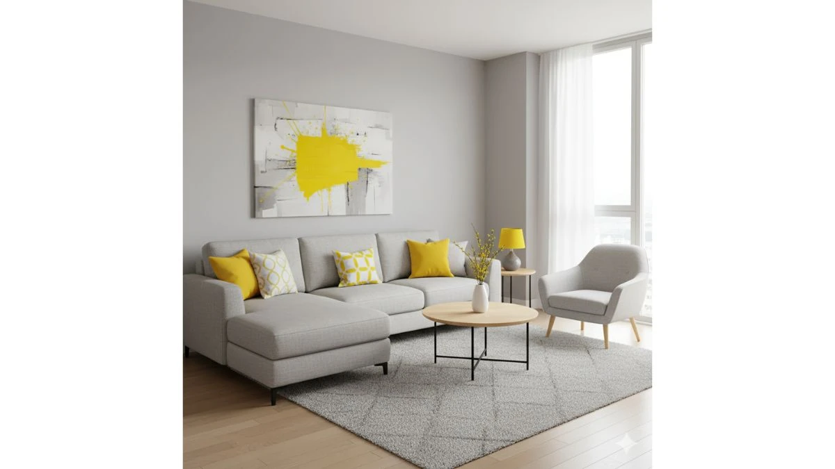
6. Light Grey & Lemon Yellow (Pops)
-
The Vibe: Energetic, cheerful, and sleek. A happy place!
-
Where to Use It: Light Grey on the walls and main furniture. Only use Lemon Yellow in small, strategic bursts—a piece of art, a couple of throw pillows, a vase.
-
Why It Works: Grey is a calming base, but sometimes it needs a kick. Yellow is pure joy and energy. The limited use keeps the yellow from overwhelming the space and gives the room a truly contemporary edge.
Light Grey provides a sleek, modern, and calming neutral base for the walls and main seating. Lemon Yellow is reserved strictly for small, energetic pops in accessories like art or pillows. The limited use of yellow provides a contemporary kick and a happy contrast to the calming grey without overwhelming the space.
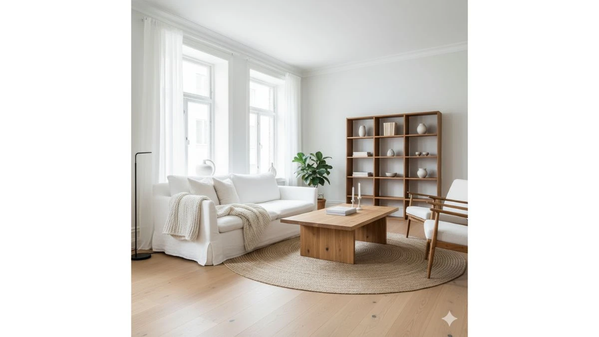
7. Classic White & Natural Wood Tones
-
The Vibe: Timeless, minimalist, and perfectly Scandinavian.
-
Where to Use It: White walls, white trim, and white ceiling. The “colour” comes from the furniture: a light oak coffee table, warm walnut shelving, or exposed wood beams.
-
Why It Works: This is the ultimate "less is more" pairing. White maximizes light and space, while the natural wood adds essential warmth and texture, making the room feel grounded and never sterile.
White walls maximize light and space, serving as the ultimate clean, minimalist backdrop. The "colour" is supplied by Natural Wood Tones (oak, walnut) in furniture and flooring, which adds essential warmth and texture. This creates a timeless, Scandinavian aesthetic that's grounded yet incredibly airy.
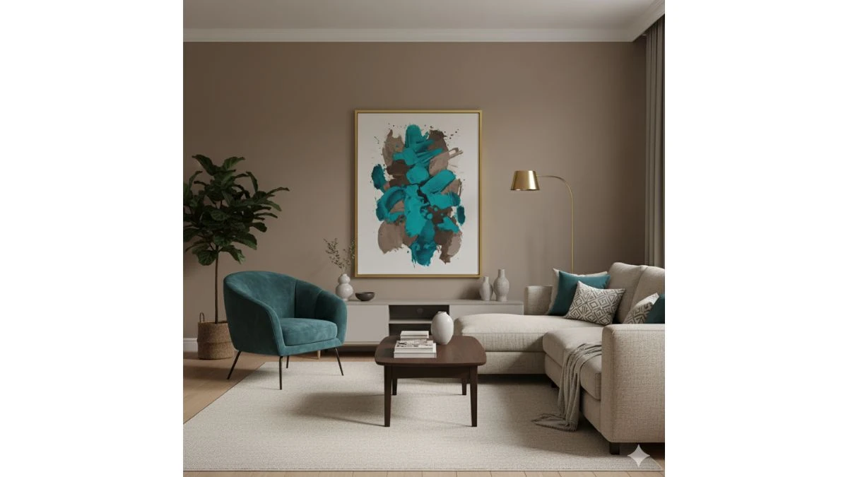
8. Warm Taupe & Teal
-
The Vibe: Cozy, rich, and a little unexpected.
-
Where to Use It: Taupe on the walls for a warm, neutral foundation. Teal is fantastic for a velvet armchair or a large piece of art.
-
Why It Works: Taupe (a grey-brown mix) provides a snug feeling. Teal is a beautiful jewel tone that adds richness and a touch of the dramatic. It’s a great combo if you want cozy comfort with an elegant twist.
Warm Taupe on the walls creates a snug, neutral foundation that's cozier than pure grey. Teal is introduced via a velvet chair or rich artwork, acting as a deep, jewel-toned accent. This mix delivers cozy comfort and richness, making the space feel both inviting and elegantly layered.
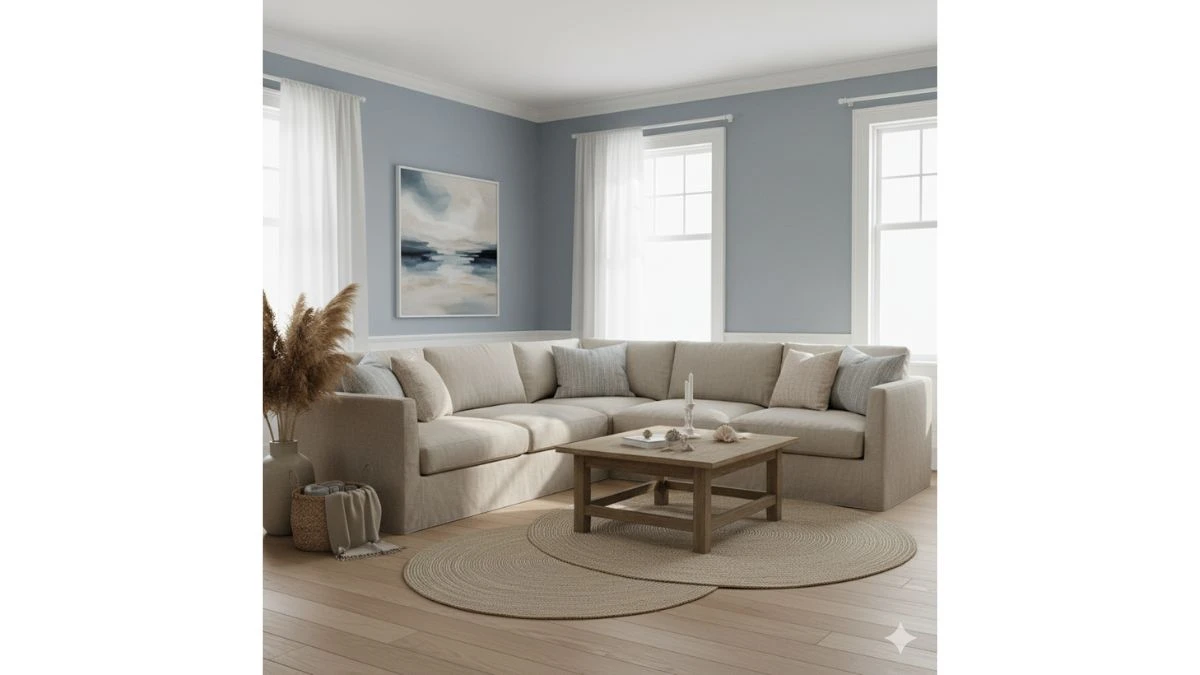
9. Dusty Blue & Sand Beige
-
The Vibe: Coastal, tranquil, and airy. You can almost smell the sea salt.
-
Where to Use It: Dusty Blue on the walls. Sand Beige for a linen sofa and natural fiber rugs.
-
Why It Works: This combination whispers relaxation. The muted blue is calmer than a bright aqua, and the sandy neutral gives it a gorgeous, sun-bleached look that’s incredibly inviting.
Use Dusty Blue on the walls for a soft, tranquil, and beautifully muted coastal atmosphere. Pair it with Sand Beige on linen sofas and rugs to maintain an airy, sun-bleached look. This combination instantly evokes relaxation and tranquility, proving that cool colours can be immensely welcoming.
10. Black & White (with a metallic accent)
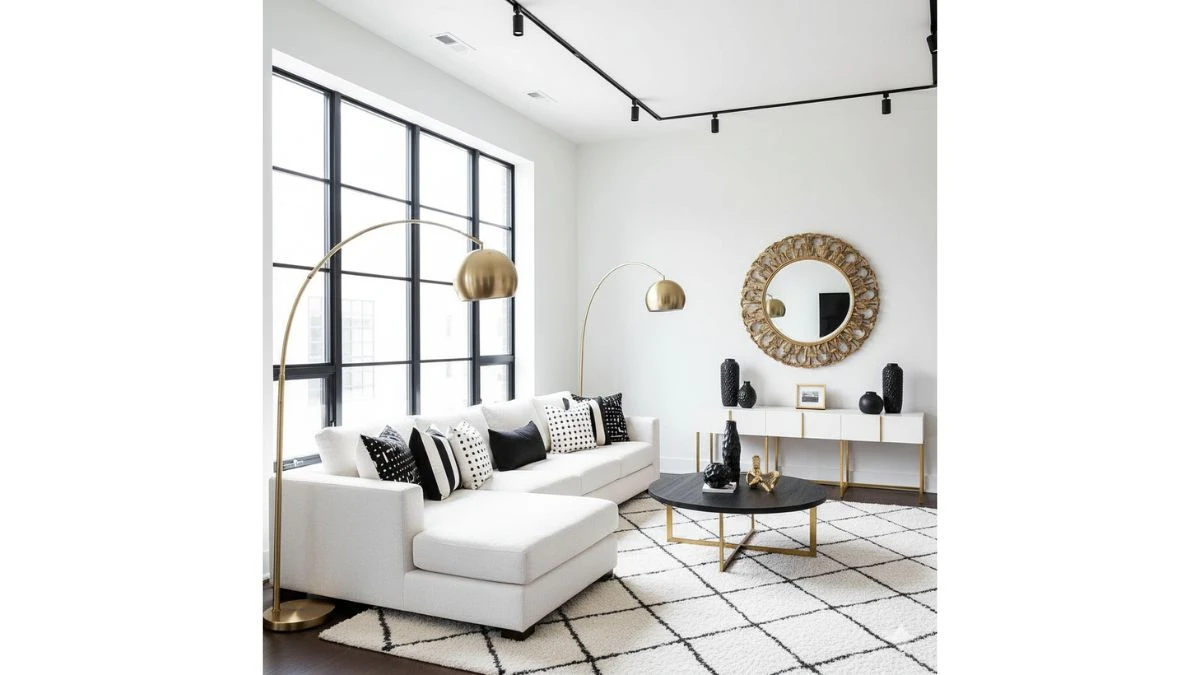
-
The Vibe: Bold, graphic, and ultra-modern. High-drama elegance.
-
Where to Use It: Think a White base with Black window frames, black light fixtures, and black-and-white patterned pillows. Add a metallic pop, like brushed bronze or gold, in a floor lamp or mirror frame.
-
Why It Works: It's the ultimate power couple. The stark contrast creates instant focus and sophistication. The metallic accent prevents it from feeling flat, adding necessary shine and texture.
Use a dominant White base with highly contrasting Black elements like window frames or light fixtures for a graphic, bold look. Add a Metallic Accent (gold/brass) to fixtures or mirrors to introduce essential glamour and shine. This is a high-drama, ultra-modern scheme that excels in sophistication and visual focus.